Are you safe on the job?
Today is the 27th annual National Day of Mourning for workers killed or injured on the job.
According to WorkSafe BC, last year 143 BC workers lost their lives. In 2009 nearly 100,000 British Columbians were injured on the job. Nearly three million work days were lost.
Conceived of by CUPE National in 1984, the campaign is a Canadian initiative that has gone international. http://en.wikipedia.org/wiki/Workers%27_Memorial_Day
For this year’s April 28 event Working Design was asked to develop a new logo for the BC Federation of Labour’s annual campaign. http://www.workingdesign.net/medium/identity/
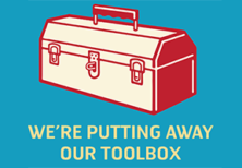
We also designed a new poster for the BC division of the Canadian Union of Public Employees (CUPE). http://www.workingdesign.net/medium/posters/
The Canadian campaign has long been symbolized by a canary in a birdcage. You probably know the story: coal miners would carry the tiny bird into the mines to detect gas in the air. Sensitive to toxic vapours, the canaries would react if poisonous gas was present. If the birds showed signs of distress – or died – the miners knew they were in danger.
Workers who have been injured or lost their lives are our society’s canaries, a warning of dangers in the workplace and a reminder of the vulnerability of workers.
Many of us work in environments that aren’t likely to lead to to being killed on the job. But, in almost every workplace we face hazards that can harm our bodies or minds.
What’s the problem and how do we fix it? Health and safety specialist Dorothy Wigmore has some answers:
“Too many workplace hazards in any workplace are ignored or not dealt with properly,” says our friend and client Dorothy Wigmore, a health and safety specialist based in Winnipeg.
Ergonomic hazards are common in most jobs, including offices. That’s why musculoskeletal injuries or disorders – another name for aches and pains, or repetitive strain injuries– are way over half the “injuries” reported to compensation boards. They also tend to be the most un-reported.
“People working at computers can expect problems with their necks, shoulders, backs, wrists and legs,” Wigmore says. “Often, they have to sit in postures that strain their bodies, in set-ups that don’t fit. Few of us are trained about how to adjust our chairs or other things we use. Many of us can’t make too many adjustments, given the set-ups we have.
Overhead office lighting usually is too bright, while we don’t have enough on the documents we use. Eye strain comes from the glare and reflections and how well our glasses let us see the screen.”
It’s not just the physical set-up. Studies show that “stress” sets us up for these health problems in our necks, shoulders and lower backs. Changing the physical set-up improves things; reducing the stressors too will more likely reduce the musculoskeletal aches and pains.
Ergonomics is about designing jobs and workplaces to meet people’s needs — whether physical and mental. It’s an art and science, Wigmore says. The purpose is to prevent people getting hurt because of their work.
Wigmore recommends ergonomic assessments to look at things such as seating, where the monitor is, and keyboards — truly ergonomic ones can be adjusted in three dimensions and usually have a separate number pad. Standing is also a big hazard (linked to high blood pressure and other health effects)
“Assessments are hard to do on your own. You really need another set of eyes,” Wigmore says. “Ergonomists can help. For on-going activities, train the folks on health and safety committees, have an ergonomics committee and get an ergonomic buddy system going.” They’re all part of participatory ergonomics programmes (http://www.iwh.on.ca/pe-guide); studies say they’re the most effective.
More information and useful resources
- The Institute for Work & Health’s materials about preventing “musculoskeletal disorders”
- Ergonomics and mapping materials in the Safety and Health Toolbox of the guide for joint health and safety committees, “Seeing the workplace with new eyes”, for which Wigmore was the main author
- The many materials about ergonomics prepared by the Canadian Centre for Occupational Health and Safety (CCOHS)
- The “ideas bank”, interactive computer workstation layout course and other materials from the State of Washington’s Department of Labor and Industries
- The many materials and international links from the UK’s Hazards group
- And for more academic resources, Karen Messing (a leading specialist in women’s occupational health) does very important and practical work
Dorothy Wigmore can be contacted at: [email protected]. Read her latest item on the Day of Mourning written for the Canadian Centre for Policy Alternatives in Manitoba: http://bit.ly/ipfQZW. Keep an eye out for her soon-to-be launched website which we are helping develop.
The canary logo and our new version

There have been many versions of the canary logo generated over the years, as unions and federations across Canada created their own publicity materials. But one image is most common – a shaded and textured ink drawing of a bird in a cage.
That illustration has an old-fashioned feel, which evokes the 19th century coal mine tale. Its style is detailed and difficult to render at a small size or apply to items like clothing.
Using the new logo we developed, The BC Federation of Labour, is creating a unified look for all their materials. The new art reproduces well at all sizes and applications, from banners to buttons to baseball hats.
As you can see, we gave the iconic canary image a cleaner and more contemporary feel. We maintained the black and yellow colour associated with danger and simplified the lines. We re-styled the bird while trying to maintain a serious tone (it’s amazing how every small bird drawing these days reminds you of the Twitter bird). We incorporated the BC Fed’s name in a way that echos their own logo. And we popped the bird partway out of its cage to suggest a sense of hope and empowerment.
For CUPE we designed a full page ad for their member magazine, the Public Employee. We wanted a bold graphic treatment and a focus on the striking shape of the bird. Here, too, we foregrounded the canary and dropped the cage back for a greater sense of openness and movement.