Newsletters & Magazines
Our publication designs have been winning awards for our clients for more than 20 years through CALM – the Canadian Association of Labour Media. Does your publication need a new design or a content and design audit? Let’s be in touch.
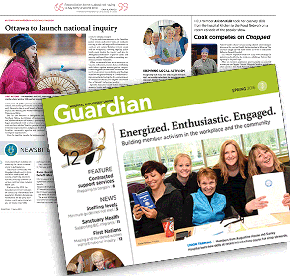
Hospital Employees' Union The Guardian
- Project The Guardian
- Client Hospital Employees' Union
- Client Since 1992
- Sector Union
Working Design has been designing materials for HEU – the Hospital Employees’ Union – since 1991 when we redesigned the flagship Guardian publication. That effort was awarded the first of many HEU design (and other) honours from CALM – the Canadian Association for Labour Media.
This 2016 edition shows the third Guardian redesign we’ve collaborated on with the union’s communications department. Not only does it feature a new look, reorganized content and some new sections, it also marks a return to full colour.
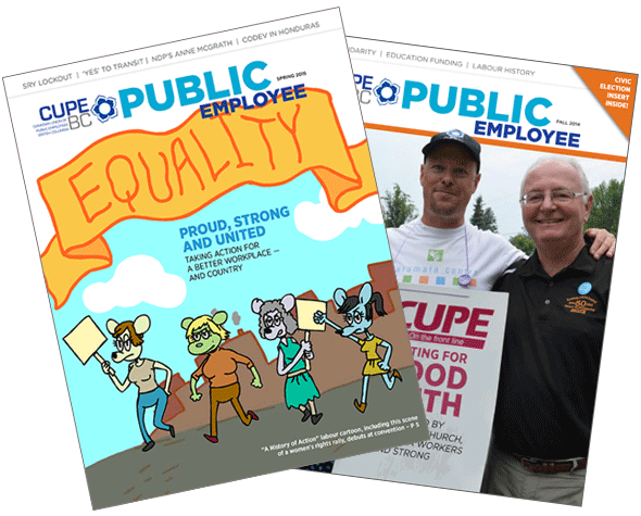
Canadian Union of Public Employees - BC CUPE BC Public Employee
- Project CUPE BC Public Employee
- Client Canadian Union of Public Employees - BC
- Client Since 1992
- Sector Union
In 2014 we updated the design of the CUPE BC’s Public Employee to reflect a changing of the guard in the union’s leadership. The PE has one of the largest circulations of any union publication in Canada. We’ve been proud to be associated with the magazine for more than 20 years, helping it win several awards from CALM – the Canadian Association of Labour Media.
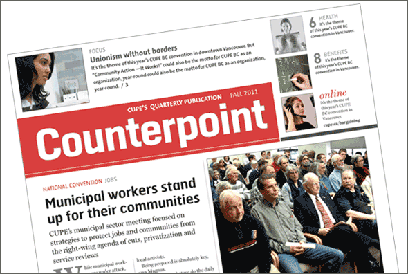
Canadian Union of Public Employees Counterpoint
- Project Counterpoint
- Client Canadian Union of Public Employees
- Client Since 1992
- Sector Union
Our ongoing redesign of all print materials for the national office of CUPE (Canadian Union of Public Employees} – one of Canada’s largest unions – started with a thorough communications audit of the organization’s newsletters and the flagship national publication, Counterpoint. We restructured and redesigned the full colour tabloid. And it paid off! The paper won the 2011 award for Best Overall Publication from CALM, the Canadian Association of Labour Media.
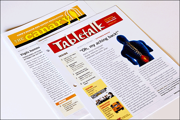
Canadian Union of Public Employees Canary and Tabletalk
- Project Canary and Tabletalk
- Client Canadian Union of Public Employees
- Client Since 2010
- Sector Union
The overall redesign of CUPE’s newsletters features consistent typestyles and page structures. Each publication has a unique flag – the treatment for the publication’s name – and its own colour. The newsletters are devoted to four of CUPE’s main issues areas and, as a result, have different kinds of content which give them an identifiably different look. Canary is focused on health and safety issues, while Tabletalk is about bargaining. Two other newsletters – one about economic issues and another about international solidarity – will be redesigned in the coming year.
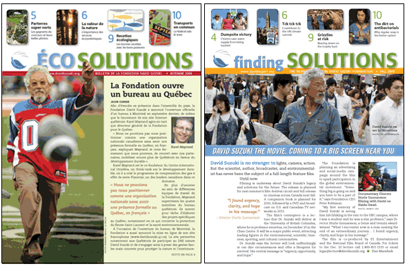
David Suzuki Foundation Finding Solutions
- Project Finding Solutions
- Client David Suzuki Foundation
- Sector NGO / Environment
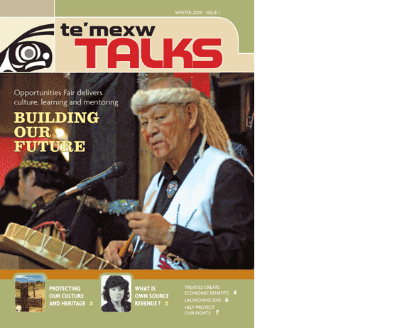
Te'mexw Treaty Association Te’mexw Talks
- Project Te’mexw Talks
- Client Te'mexw Treaty Association
- Sector Association