Strategic Communications CCPA Canada Pension Package
- Project CCPA Canada Pension Package
- Client Strategic Communications
- Client Since 2002
- Sector Fundraising
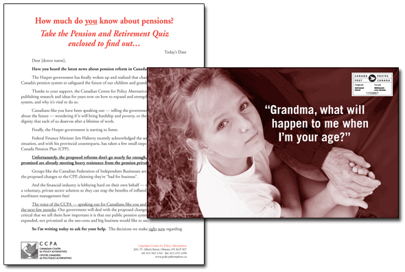
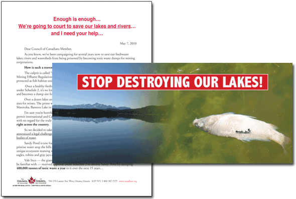
Working within the proven guidelines for successful direct mail design, we’ve had the opportunity to develop a number of control packages for Strategic Communications and several of their clients. This package raised funds for a pension campaign by the national office of the Canadian Centre for Policy Alternatives – CCPA.
Strategic Communications Council of Canadians Water Pollution Package
- Project Council of Canadians Water Pollution Package
- Client Strategic Communications
- Client Since 2002
- Sector Fundraising
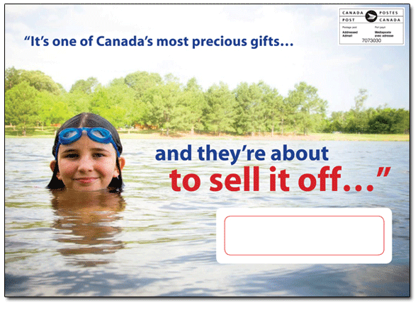
Strategic Communications Council of Canadians Water Pollution Package
- Project Council of Canadians Water Pollution Package
- Client Strategic Communications
- Client Since 2002
- Sector Fundraising
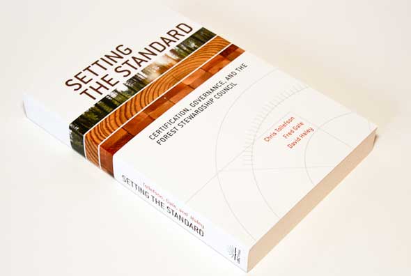
UBC Press Setting the Standard cover design
- Project Setting the Standard cover design
- Client UBC Press
- Client Since 2004
- Sector Publisher
Setting the Standard is the second book cover we designed for UBC Press on forestry policy and for our colleague Chris Tollefson, a professor in environmental law at UVic. The book deals with certified logging to ensure sustainable harvesting. The cover images illustrate the forest, a logged tree and refined wood.
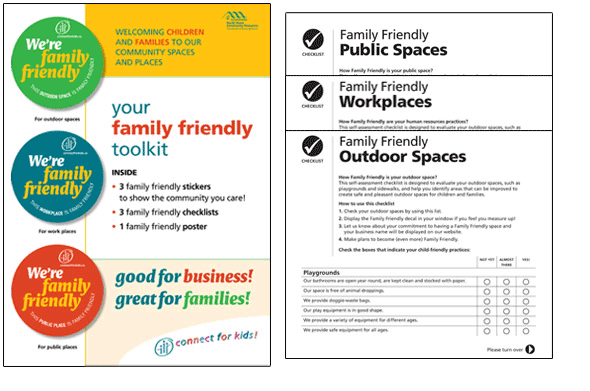
North Shore Community Resources Family Friendly campaign kit
- Project Family Friendly campaign kit
- Client North Shore Community Resources
- Client Since 2008
- Sector Social services
The North Shore Resources Society provides a host of services for families in North and West Vancouver. This Family Friendly campaign encourages local businesses to treat their employees well and welcome families, and children by providing basic amenities. Businesses were provided with a kit and stickers to mount in their windows showing their participation.
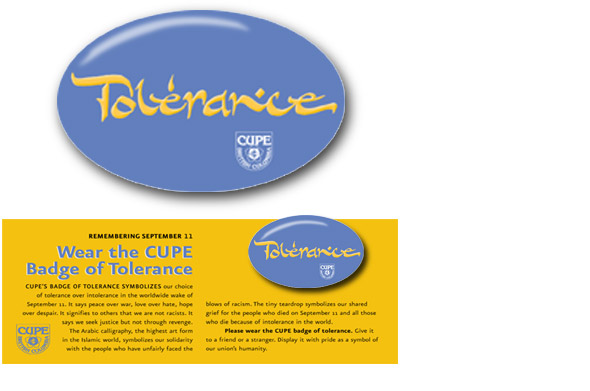
BC, Canadian Union of Public Employees Button
- Project Button
- Client BC, Canadian Union of Public Employees
- Client Since 1992
- Sector Union
This button, produced in the aftermath of the 2001 attack on New York’s World Trade Centre, won a CALM award for CUPE – the Canadian Union of Public Employees. CALM is the Canadian Association of Labour Media.
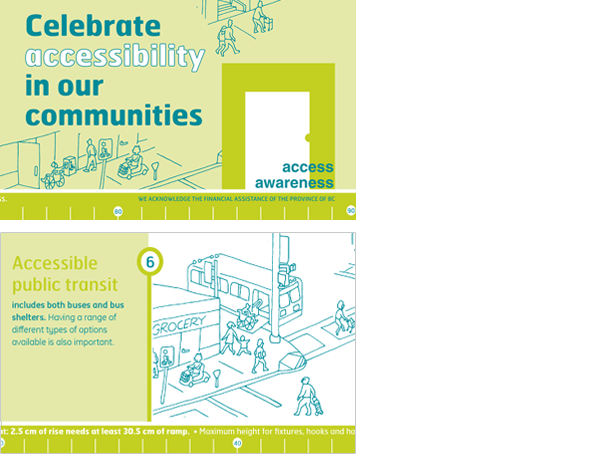
SPARC BC Access Awareness Day
- Project Access Awareness Day
- Client SPARC BC
- Client Since 2002
- Sector Social services
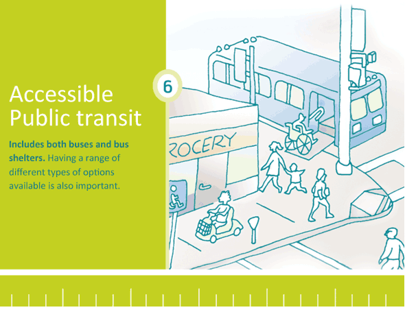
Sponsored by the Social Planning and Research Council of BC ( SPARC BC), the annual Access Awareness Day highlights accessibility issues in all environments from buildings to streets and more. This seven-panel brochure features a 36 inch / 91.5 cm measuring tape across the bottom. This represents the required width of a pathway or corridor to allow for wheelchair use. Download the PDF.
SPARC BC Access Awareness Day presentation
- Project Access Awareness Day presentation
- Client SPARC BC
- Client Since 2002
- Sector Social services
Heat and Frost Insulators The Magic of Mechanical Insulation!
- Project The Magic of Mechanical Insulation!
- Client Heat and Frost Insulators
- Client Since 2010
- Sector Union

SPARC BC Presentation for anti-poverty campaign
- Project Presentation for anti-poverty campaign
- Client SPARC BC
- Client Since 2002
- Sector Social services
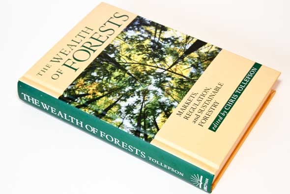
UBC Press The Wealth of Forests cover design
- Project The Wealth of Forests cover design
- Client UBC Press
- Client Since 2004
- Sector Publisher
New Year card, 2013
- Project New Year card, 2013
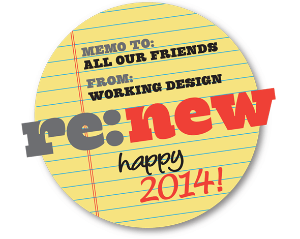
New Year card, 2014
- Project New Year card, 2014
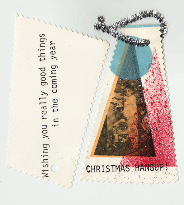
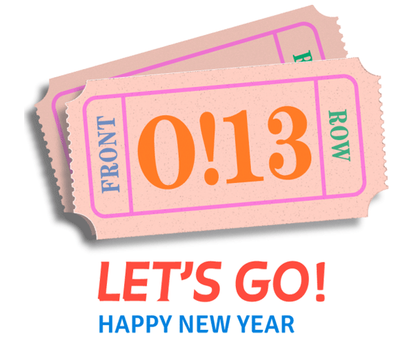
New Year card 2015
- Project New Year card 2015

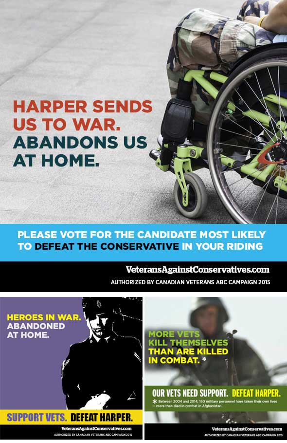
Veterans ABC Campaign Social media graphics
- Project Social media graphics
- Client Veterans ABC Campaign
A series of high impact shareable graphics that tell the story of Canadian vets struggling to receive the care and support they deserve.
Pacific Centre for Environmental Law and Litigation Logo
- Project Logo
- Client Pacific Centre for Environmental Law and Litigation
- Client Since 2016
- Sector Environmental law
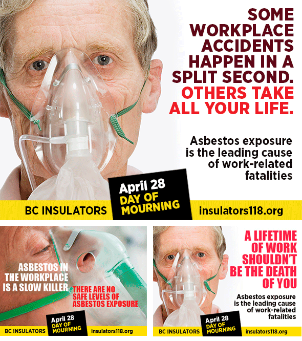
Heat and Frost Insulators Social media graphics
- Project Social media graphics
- Client Heat and Frost Insulators
This set of social media graphics for the labour movement’s National Day or Mourning bluntly confronts the ongoing health issues related to asbestos in the workplace.
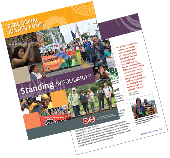
Public Service Alliance of Canada Annual report
- Project Annual report
- Client Public Service Alliance of Canada
- Client Since 2012
- Sector Union
Read the 2015 Social Justice Fund Report.
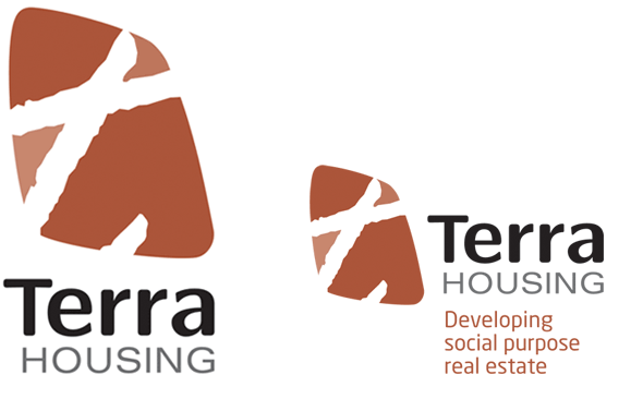
Terra Housing Identity
- Project Identity
- Client Terra Housing
- Client Since 2009
- Sector Social housing
The Terra logo uses a rough, angled lowercase letter ‘t’ to symbolize the organization’s hands on project style. The asymmetrical spaces carved by the letterform suggest a dynamic division of land while the white space maps a path and direction. The overall rounded, organic shape reflects the flexible and accessible process Terra engages in with its diverse range of clients.
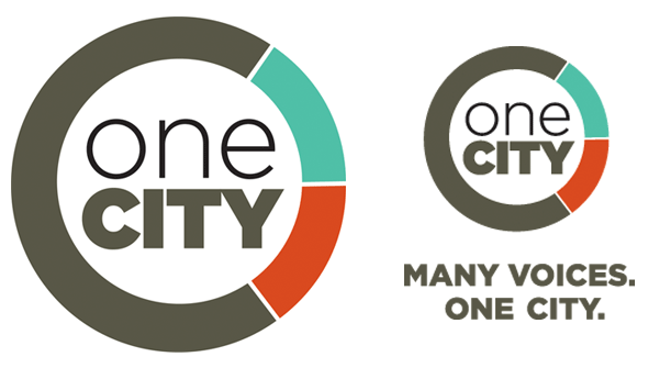
One City Civic political party logo
- Project Civic political party logo
- Client One City
- Client Since 2014
- Sector Political party
This new Vancouver civic political party wanted a logo to communicate their fresh approach. The circle represents unity, while the coloured segments illustrate diversity, expression and integration. The overall shape incorporates both O and C, and encloses the group’s name, which juxtaposes a strong base for “city” with a lighter, less formal “one”.
Century Group Identity for corporate intranet
- Project Identity for corporate intranet
- Client Century Group
- Client Since 2011
- Sector Business
Century Group developed an internal social media and networking platform for their 350 employees, and needed a tagline and identity mark to customize the interface and act as a wayfinding device. The “mycentury” and “mybria” marks are integrated into the framework to identify different types of content, and used on various promotional materials. The language and tagline emphasize the fresh, collaborative and transparent approach this new website embodies for the company.

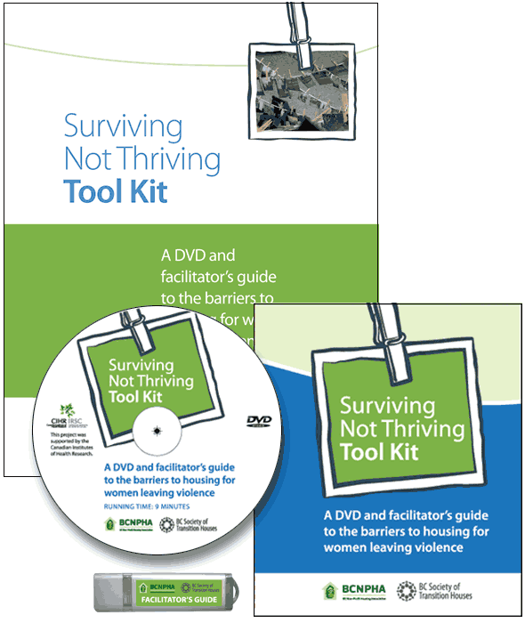
BC Non Profit Housing Association Facilitator’s handbook and DVD
- Project Facilitator’s handbook and DVD
- Client BC Non Profit Housing Association
- Client Since 2010
- Sector Research
This educational DVD and workshop facilitator’s guide is part of a larger public education and research project examining access to housing for women leaving violent relationships. This package includes the facilitator’s guide as a PDF on an enclosed thumb drive, and a short video exploring the “Shedding Light on the Barriers to Housing for Women Leaving Violent Relationships: A Photovoice Exploration” project.
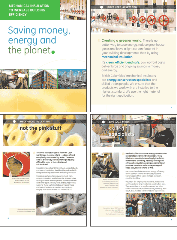
Heat and Frost Insulators, Local 118 Promotional report on mechanical insulation industry
- Project Promotional report on mechanical insulation industry
- Client Heat and Frost Insulators, Local 118
- Client Since 2010
- Sector Union
BC’s mechanical insulators’ union developed this campaign to raise awareness about the environmental benefits and cost savings of properly installed mechanical insulation.
We also developed a website as a key component of the campaign.
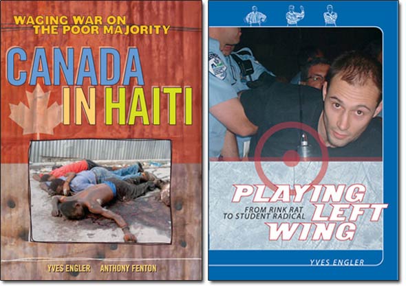
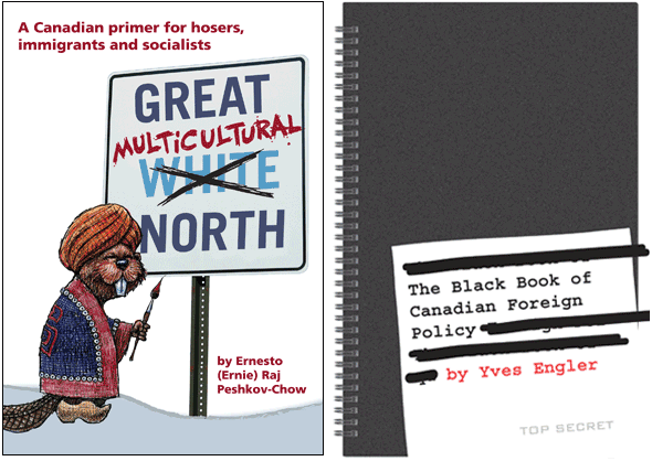
Fernwood Publishing/Red Publishing Cover and inside page design
- Project Cover and inside page design
- Client Fernwood Publishing/Red Publishing
- Client Since 2006
- Sector Publisher
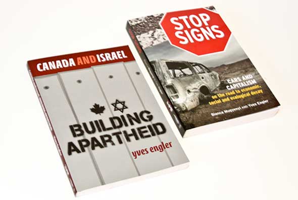
We’ve had the good luck to do a number of commissioned covers for Red Publishing through our colleague Gary Engler, a seasoned journalist and union activist. Three of the books have been authored by his son Yves and Gary wrote The Great Multicultural North (see below).
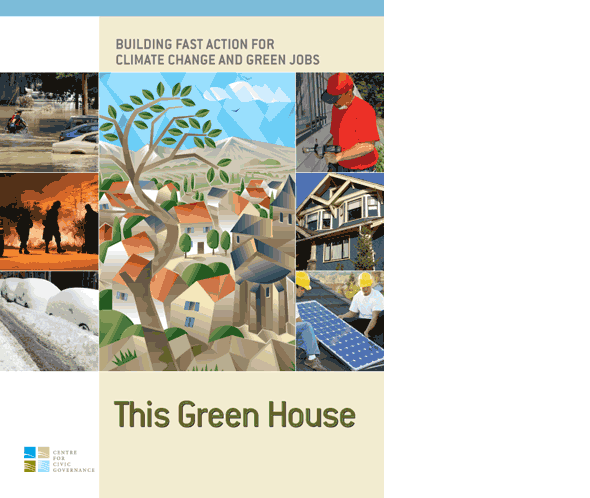
Columbia Institute Report on energy-efficient homes
- Project Report on energy-efficient homes
- Client Columbia Institute
- Sector Association
This Green House: Building Fast Action on Climate Change and Green Jobs examines a core idea:
Municipalities providing low-cost financing to cover the upfront cost of energy-efficient retrofits and
property owners repaying over time on their property taxes with their energy savings.
North Shore Community Services Pregnancy and Baby Expo
- Project Pregnancy and Baby Expo
- Client North Shore Community Services
- Client Since 2008
- Sector Social services

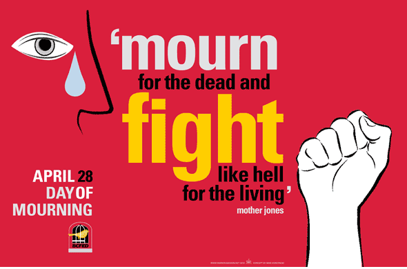
Canadian Union of Public Employees - BC National Day of Mourning
- Project National Day of Mourning
- Client Canadian Union of Public Employees - BC
- Client Since 1992
- Sector Union
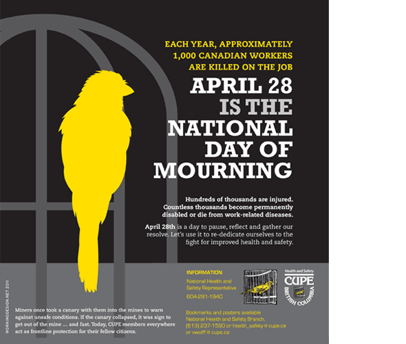
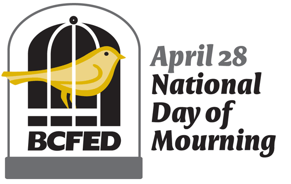
BC Federation of Labour National Day of Mourning
- Project National Day of Mourning
- Client BC Federation of Labour
- Client Since 1998
- Sector Union
We worked with the BD Fed’s Nina Hansen using a concept developed by US illustrator Mike Konopacki to develop the 2012 Day of Mourning poster. The event honours dead and injured workers each April 28.
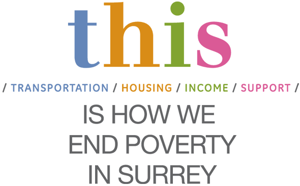
SPARC BC t.h.i.s. identity
- Project t.h.i.s. identity
- Client SPARC BC
- Client Since 2002
- Sector Social services
“THIS” stands for four elements needed to end poverty: transportation, housing, income and support. We developed this logo for anti-poverty organizers in Surrey (and our longtime client SPARC – Social Planning, Action and Research Council ) who have been working closely on this issue with support from Surrey City Council.
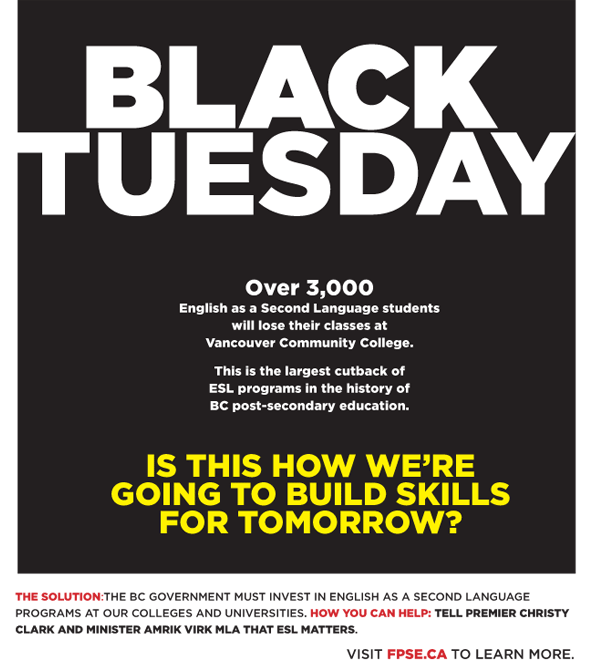
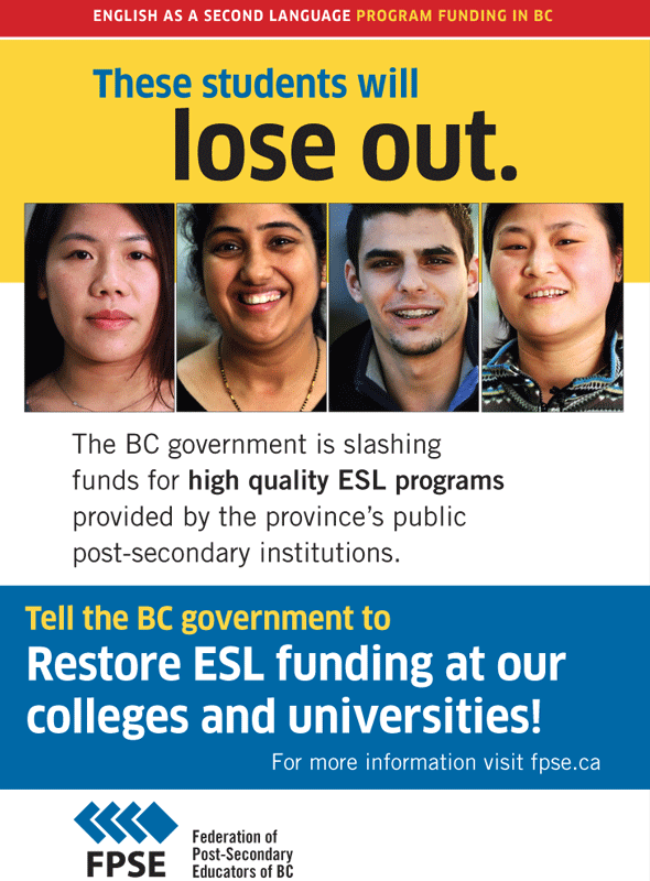
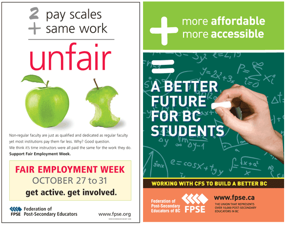
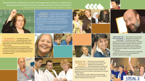
Federation of Post Secondary Educators of BC Education funding cuts campaign
- Project Education funding cuts campaign
- Client Federation of Post Secondary Educators of BC
- Client Since 1997
- Sector Union
The Federation of Post-Secondary Educators of BC have been waging a campaign against BC government funding cutbacks targeting English as a Second Language programs at the province’s post-secondary institutes. We worked with FPSE’s Phillip Legg on developing some print materials for the campaign.
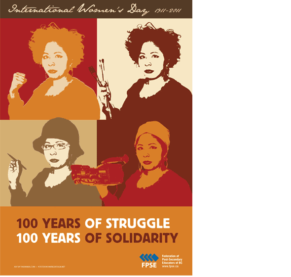
Federation of Post Secondary Educators of BC International Women’s Day
- Project International Women’s Day
- Client Federation of Post Secondary Educators of BC
- Client Since 1997
- Sector Union
For this International Women’s Day poster we used art by Favianna Rodriguez, a printmaker and digital artist based in Oakland, California, whose work is inspired and informed by the stylistic and radical impact of Chicano painters and printmakers.
Using high-contrast colors and vivid figures, her composites reflect literal and imaginative migration, global community, and interdependence. Whether her subjects are immigrant day laborers in the U.S., mothers of disappeared women in Juárez, Mexico, or her own abstract self portraits, Rodriguez brings new audiences into the art world by refocusing the cultural lens. Through her work we witness the changing U.S. metropolis and a new diaspora in the arts. Check out her work.
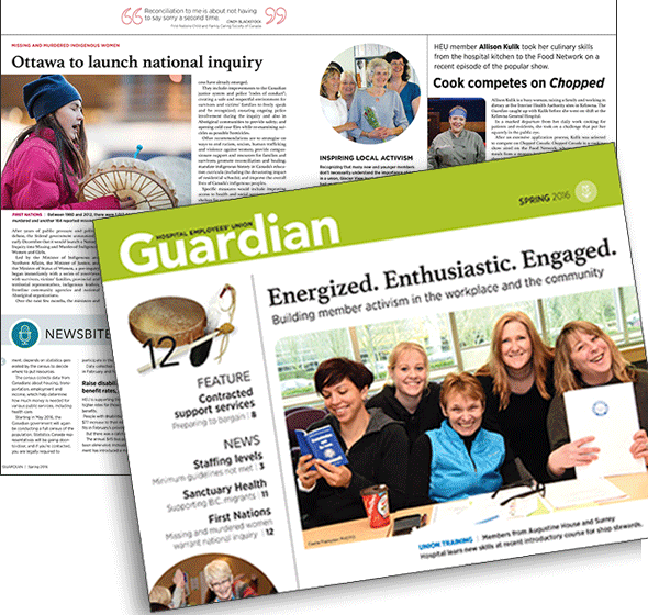
Hospital Employees' Union The Guardian
- Project The Guardian
- Client Hospital Employees' Union
- Client Since 1992
- Sector Union
Working Design has been designing materials for HEU – the Hospital Employees’ Union – since 1991 when we redesigned the flagship Guardian publication. That effort was awarded the first of many HEU design (and other) honours from CALM – the Canadian Association for Labour Media.
This 2016 edition shows the third Guardian redesign we’ve collaborated on with the union’s communications department. Not only does it feature a new look, reorganized content and some new sections, it also marks a return to full colour.
Federation of Post Secondary Educators of BC Education funding cuts campaign
- Project Education funding cuts campaign
- Client Federation of Post Secondary Educators of BC
- Client Since 1997
- Sector labour, Union
Fernwood Publishing/Red Publishing Cover design
- Project Cover design
- Client Fernwood Publishing/Red Publishing
- Client Since 2006
- Sector Publisher
Besides engaging Working Design to design the cover and insides for these two projects, Gary Engler from Red Publishing also hired Vancouver Province cartoonist Bob Krieger to draw a few ‘toons for the Great Multicultural North.
BC Centre of Excellence for Women's Health Phi Women
- Project Phi Women
- Client BC Centre of Excellence for Women's Health
- Client Since 2004
- Sector Health
Phi Women stands for Promoting Health in Women. It is also a letter in the Greek alphabet. We developed a stylized version of the character and combined it with a horizontal stroke to evoke the women’s symbol.

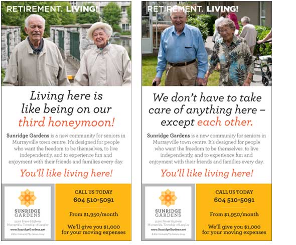
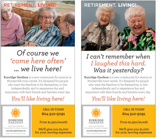
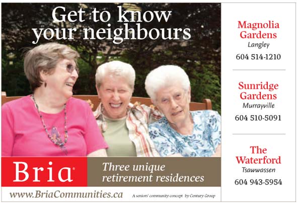
Century Group Sunridge Gardens
- Project Sunridge Gardens
- Client Century Group
- Client Since 2011
- Sector Business
We named the “Retirement. Living!” series and wrote the campaign text advertising the new Sunridge Gardens senior’s residence near Langley. The project’s developer, Century Group, wanted to establish a unique identity for their third such project under their Bria brand. Our various headlines use humour, respect and warmth to convey that the residence offers camaraderie, comfort, activity, fun and great food!
Brian
- Project Brian

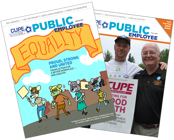
Canadian Union of Public Employees - BC CUPE BC Public Employee
- Project CUPE BC Public Employee
- Client Canadian Union of Public Employees - BC
- Client Since 1992
- Sector Union
In 2014 we updated the design of the CUPE BC’s Public Employee to reflect a changing of the guard in the union’s leadership. The PE has one of the largest circulations of any union publication in Canada. We’ve been proud to be associated with the magazine for more than 20 years, helping it win several awards from CALM – the Canadian Association of Labour Media.
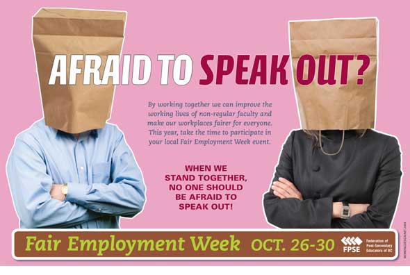
Federation of Post Secondary Educators of BC Fair Employment Week 2011
- Project Fair Employment Week 2011
- Client Federation of Post Secondary Educators of BC
- Client Since 1997
- Sector Union
Federation of Post Secondary Educators of BC Fair Employment Week 2009
- Project Fair Employment Week 2009
- Client Federation of Post Secondary Educators of BC
- Client Since 1997
- Sector Union
This Fair Employment Week poster for the Federation of Post-Secondary Educators (FPSE) addresses two-tier wage scales for permanent and part-time college employees who do the same work.
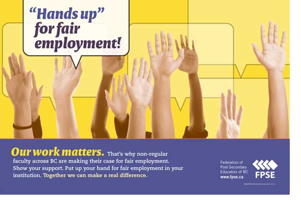
Federation of Post Secondary Educators of BC Hands Up for Education campaign
- Project Hands Up for Education campaign
- Client Federation of Post Secondary Educators of BC
- Client Since 1997
- Sector Union

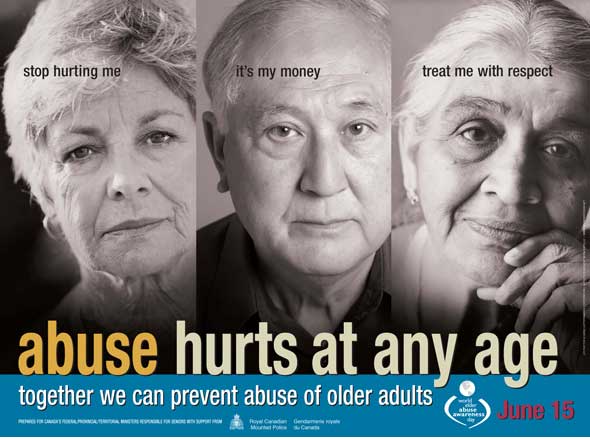
BC Coalition for the Elimination of Abuse Against Seniors World Elder Abuse Awareness Week
- Project World Elder Abuse Awareness Week
- Client BC Coalition for the Elimination of Abuse Against Seniors
- Sector NGO / Seniors
Century Group Sunridge Gardens
- Project Sunridge Gardens
- Client Century Group
- Client Since 2011
- Sector Business
Communications, Energy and Paperworkers, Western Region CEP Western Region Organizing Campaign
- Project CEP Western Region Organizing Campaign
- Client Communications, Energy and Paperworkers, Western Region
- Client Since 2011
- Sector Union

BC Federation of Labour Campaign identity
- Project Campaign identity
- Client BC Federation of Labour
- Client Since 1998
- Sector Union
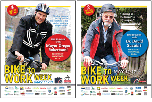
Vancouver Area Cyclng Coalition VACC Bike to Work Week
- Project VACC Bike to Work Week
- Client Vancouver Area Cyclng Coalition
- Sector NGO / Transportation
Working Design and Vancouver photographer Mona Kayello volunteered our work for the Vancouver Area Cycling Coalition Bike to Work Week campaign.
Century Group Bria Communities
- Project Bria Communities
- Client Century Group
- Client Since 2011
- Sector Business
Federation of Post Secondary Educators of BC Fair Employment Week
- Project Fair Employment Week
- Client Federation of Post Secondary Educators of BC
- Client Since 1997
- Sector Union
Fernwood Publishing/Red Publishing Cover Designs
- Project Cover Designs
- Client Fernwood Publishing/Red Publishing
- Client Since 2006
- Sector Publisher
Planned Lifetime Advocacy Network Cover and inside page design
- Project Cover and inside page design
- Client Planned Lifetime Advocacy Network
- Client Since 1996
- Sector NGO / Developmental Disabilities
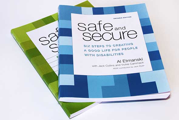
We’ve had a long and fruitful working relationship with PLAN – the Planned Lifetime Advocacy Network. Safe and Secure is their flagship book publication and we’ve been involved with it from the start. It outlines what’s involved in building a lifelong circle of support for people with developmental disabilities and their families. The book has been redesigned and editions have been produced for other provinces and countries.
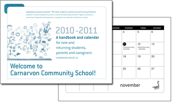
Carnarvon Community School 50th Anniversary
- Project 50th Anniversary
- Client Carnarvon Community School
- Client Since 2004
- Sector School
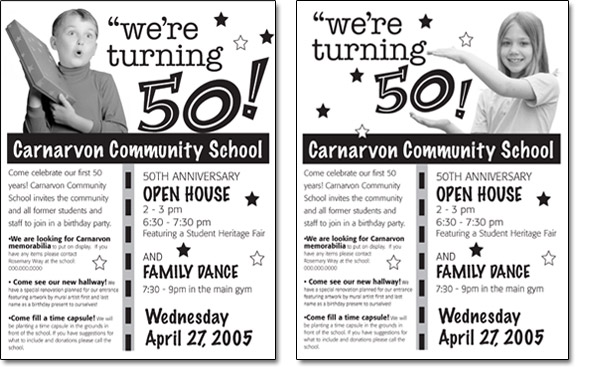
When his kids were young, Working Design president Kris Klaasen volunteered on the PAC –Parent Advisory Council – at Carnarvon Community School. These little posters were designed to mark the school’s anniversary.
Canadian Union of Public Employees Counterpoint
- Project Counterpoint
- Client Canadian Union of Public Employees
- Client Since 1992
- Sector Union
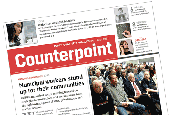
Our ongoing redesign of all print materials for the national office of CUPE (Canadian Union of Public Employees} – one of Canada’s largest unions – started with a thorough communications audit of the organization’s newsletters and the flagship national publication, Counterpoint. We restructured and redesigned the full colour tabloid. And it paid off! The paper won the 2011 award for Best Overall Publication from CALM, the Canadian Association of Labour Media.
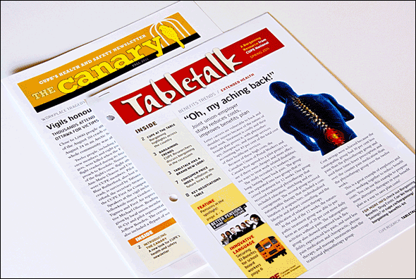
Canadian Union of Public Employees Canary and Tabletalk
- Project Canary and Tabletalk
- Client Canadian Union of Public Employees
- Client Since 2010
- Sector Union
The overall redesign of CUPE’s newsletters features consistent typestyles and page structures. Each publication has a unique flag – the treatment for the publication’s name – and its own colour. The newsletters are devoted to four of CUPE’s main issues areas and, as a result, have different kinds of content which give them an identifiably different look. Canary is focused on health and safety issues, while Tabletalk is about bargaining. Two other newsletters – one about economic issues and another about international solidarity – will be redesigned in the coming year.
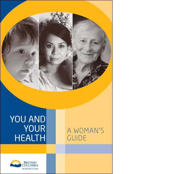
BC Centre of Excellence for Women's Health Women’s Health Guide
- Project Women’s Health Guide
- Client BC Centre of Excellence for Women's Health
- Client Since 2004
- Sector Health
The Women’s Health Guide was researched and written by the BC Centre of Excellence for Women’s Health and was produced by the BC government.
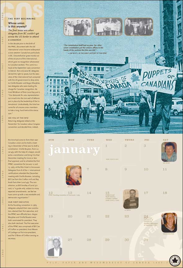
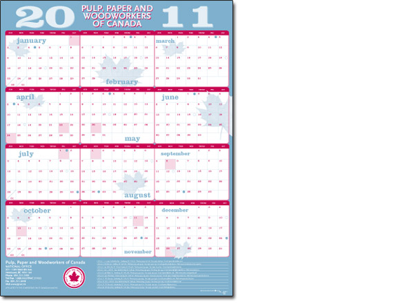
Pulp and Paper Workers of Canada Anniversary calendar
- Project Anniversary calendar
- Client Pulp and Paper Workers of Canada
- Client Since 1990
- Sector Union
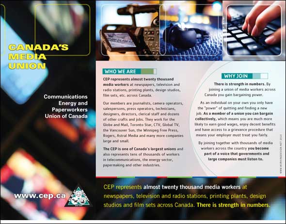
CEP 2000 The Media Union Organizing campaign
- Project Organizing campaign
- Client CEP 2000 The Media Union
- Client Since 1997
- Sector Union
Our union—the Communication, Energy and Paperworkers of Canada—needed sharp new materials to launch an organizing drive. The look conveys the image of a modern and progressive organization comfortable with new technology and the rapidly changing media environment.
Coasters, 2008
- Project Coasters, 2008
These coasters, printed on heavy gauge stock, are one of our most popular seasonal projects. We still have a small supply left to give away. Drop by or call us if you’d like one.
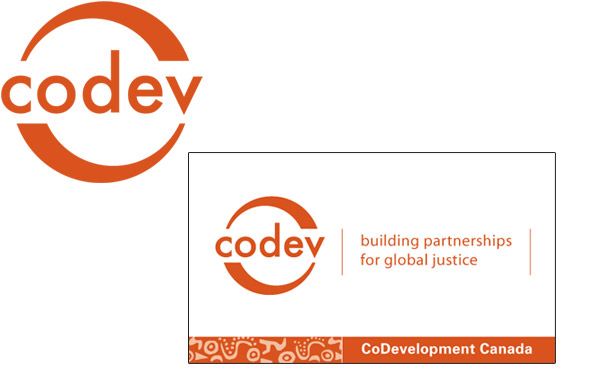
CoDevelopment Canada Identity
- Project Identity
- Client CoDevelopment Canada
- Client Since 2004
- Sector NGO / Development education
CoDevelopment Canada—or Codev—is a development agency that builds partnerships between Canadians and Latin Americans. Our branding campaign for the organization includes this logo which demonstrates the north/south collaboration that drives the group’s work.
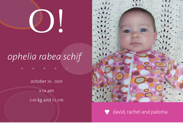
Ophelia
- Project Ophelia
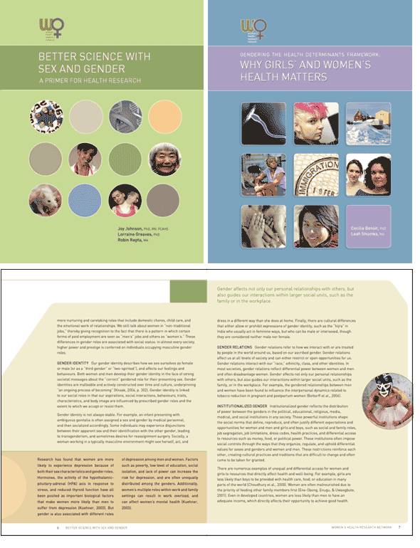
Women's Health Research Network WHRN Research report series
- Project WHRN Research report series
- Client Women's Health Research Network
- Client Since 2008
- Sector Health
Better Science with Sex and Gender is the first of three reports we designed for The Women’s Health Research Network. The organization was established to examine issues around healthcare delivery for women using an intersectionality analysis. This research focuses on a variety of factors that can affect women’s health and their care including race, income and geography.
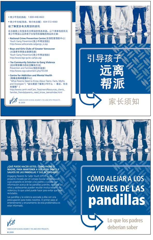
Vancouver School Board Steering Kids Away from Gangs
- Project Steering Kids Away from Gangs
- Client Vancouver School Board
- Client Since 2002
- Sector Education
Steering Kids Away from Gangs is a booklet we designed for the Vancouver School Board and which has five different language editions.
Caleb
- Project Caleb

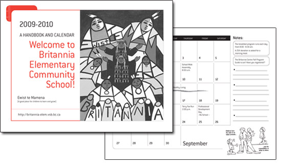
Britannia School Student and parent calendar
- Project Student and parent calendar
- Client Britannia School
- Client Since 2008
- Sector School
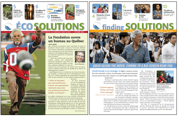
David Suzuki Foundation Finding Solutions
- Project Finding Solutions
- Client David Suzuki Foundation
- Sector NGO / Environment
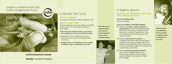
CoDevelopment Canada Endowment fund
- Project Endowment fund
- Client CoDevelopment Canada
- Client Since 2004
- Sector NGO / Development education
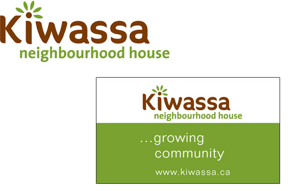
Kiwassa Neighbourhood House Kiwassa Identity and business card
- Project Kiwassa Identity and business card
- Client Kiwassa Neighbourhood House
- Client Since 2005
- Sector Social services
Our complete rebranding campaign for Kiwassa Neighbourhood House started with the design of this new logo. Executive Director Nancy McRitchie wanted the new mark to convey community, nature, growth and friendliness. We were more than happy to oblige.
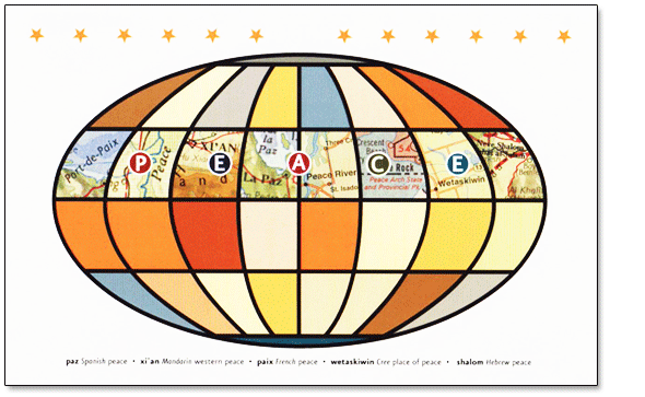
Seasons card, 2005
- Project Seasons card, 2005
For this Peace On Earth card we found five different place names on a world map that mean “peace”.
In Spain we found La Paz; in China it is xi’an; Paix in France; Wetaskiwin is the Cree word and a place name in Saskatchewan. In Israel we found a place called Neve Shalom.
We scanned these places from the map and tucked them behind the word “PEACE” and assembled them into a representation of the globe.
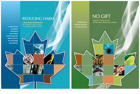
BC Centre of Excellence for Women's Health BC Centre Tobacco Research reports
- Project BC Centre Tobacco Research reports
- Client BC Centre of Excellence for Women's Health
- Client Since 2004
- Sector Health
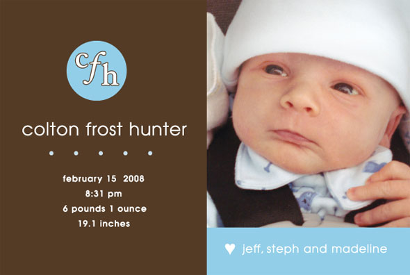
Colton
- Project Colton
Carnarvon Elementary School Student and parent calendar
- Project Student and parent calendar
- Client Carnarvon Elementary School
- Client Since 2004
- Sector School
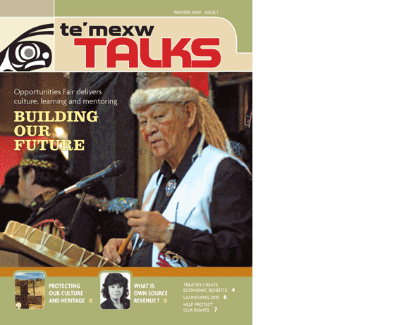
Te'mexw Treaty Association Te’mexw Talks
- Project Te’mexw Talks
- Client Te'mexw Treaty Association
- Sector Association
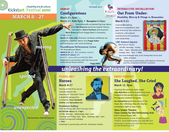
Kickstart Disability Arts & Culture Festival 2010
- Project Disability Arts & Culture Festival 2010
- Client Kickstart
- Client Since 2009
- Sector Arts
Kickstart Disability Arts and Culture mixes up performance art, theatre, visual art and dance by artists with a range of mental and physical differences. This brochure for their Festival held during the Vancouver Paralympics conveys the force and nature of their work. Logo design by our good friend Joss MacLennan.
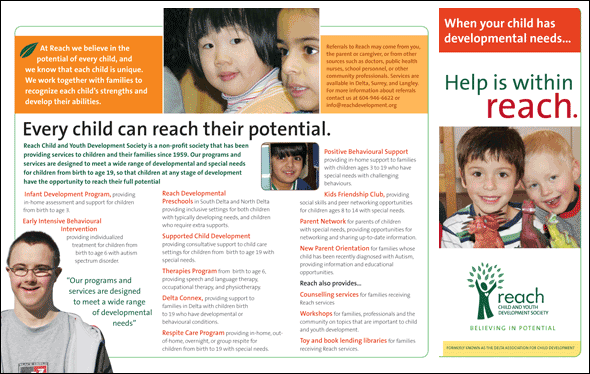
Reach Child and Youth Development Society Identity and business card
- Project Identity and business card
- Client Reach Child and Youth Development Society
- Client Since 2008
- Sector Social services
We rebranded and helped rename the REACH Child and Youth Development Society. The logo illustration by Working Designer Sam Shoicet conveys caring, growth and celebration. You can read a complete case study of our project with REACH.

Seasons card, 2010
- Project Seasons card, 2010
Twittering into the New Year with elegance!

Mia
- Project Mia

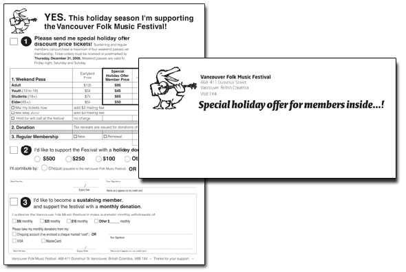
Vancouver Folk Music Festival Society VFMF Direct Mail for Members
- Project VFMF Direct Mail for Members
- Client Vancouver Folk Music Festival Society
- Client Since 1985
- Sector Fundraising
We designed and wrote this very successful year-end appeal for the Vancouver Folk Music Festival.
Pulp and Paper Workers of Canada Wall calendar
- Project Wall calendar
- Client Pulp and Paper Workers of Canada
- Client Since 1990
- Sector Union
Reach Child and Youth Development Society Program brochure series
- Project Program brochure series
- Client Reach Child and Youth Development Society
- Client Since 2008
- Sector NGO / Development education
This brochure was part of a visual identity overhaul for the REACH Child and Youth Development Society and acted as a template for all the brochures describing their extensive range of programs. We arrived at this basic design and provided REACH with an electronic template that they use in house to update or prepare new brochures. Have a look at our case study on how we helped give the organization a new name and a new logo.
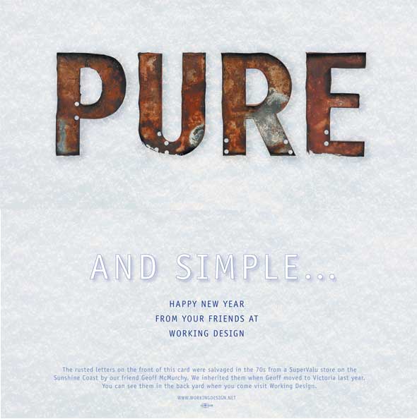
New Year card, 2006
- Project New Year card, 2006
Working Design’s Kris Klaasen is really fond of rusty things. The 4-foot tall rusted letters pictured on this card were salvaged in the 1970s from a SuperValue store on the Sunshine Coast by our friend and colleague Geoff McMurchy. (Geoff is the former Artistic Director of Kickstart Disability Arts and Culture which is featured elsewhere on our site). We inherited the letters when Geoff moved to Victoria a few years back. You can see them in the back yard when you come to visit Working Design.
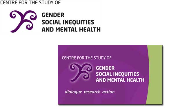
Centre for the Study of Gender, Social Inequities and Mental Health Identity and business card
- Project Identity and business card
- Client Centre for the Study of Gender, Social Inequities and Mental Health
- Client Since 2010
- Sector Health
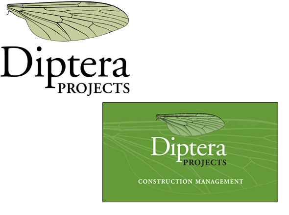
Diptera Projects Identity and business card
- Project Identity and business card
- Client Diptera Projects
- Sector Small business
Federation of Post Secondary Educators of BC Members’ brochure
- Project Members’ brochure
- Client Federation of Post Secondary Educators of BC
- Client Since 1997
- Sector Union
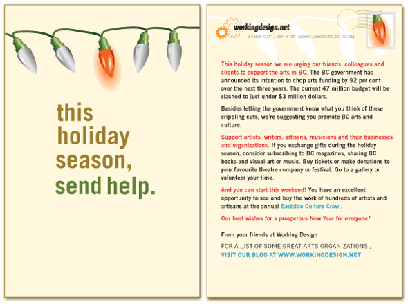
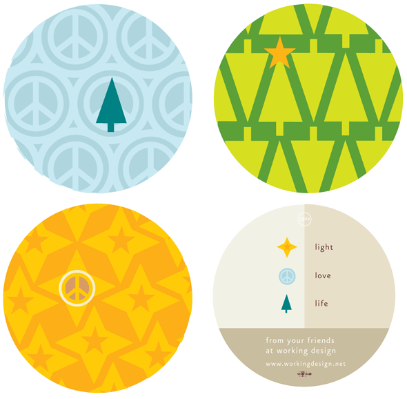
Seasons card, 2009
- Project Seasons card, 2009
in 2009 the BC government deeply cut funding for the province’s arts organizations. We used our season’s card to highlight the cuts and suggested a number of actions which could be taken. Those included supporting art groups and artists by attending events, giving presents like theatre subscriptions or volunteering your time.
Trial Lawyers Association of BC Protecting Justice campaign logo
- Project Protecting Justice campaign logo
- Client Trial Lawyers Association of BC
- Client Since 2007
- Sector Professional association

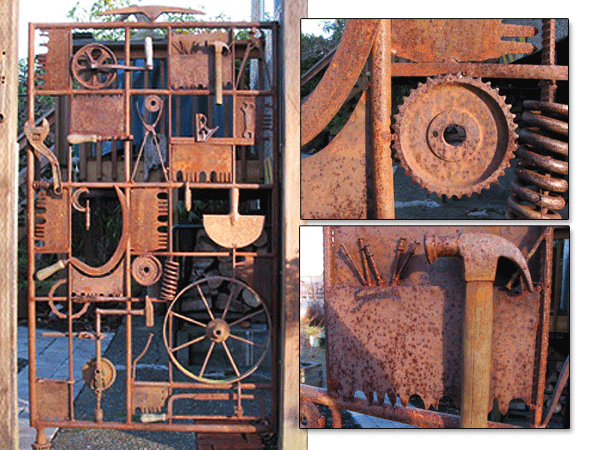
Working Design Gate
- Project Working Design Gate
The gate at Working Design’s side entrance was designed and developed in 1999 by jeweler and welder Anna Marie Gale and Kris Klaasen. We finally put the longstanding rusted things collection to good use!
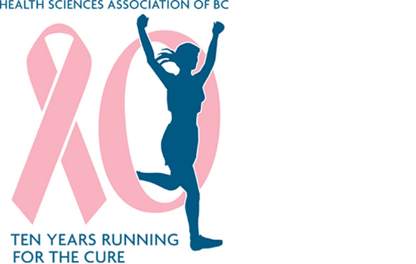
Health Sciences Association of BC Run for the Cure 10th Anniversary logo
- Project Run for the Cure 10th Anniversary logo
- Client Health Sciences Association of BC
- Client Since 1992
- Sector Union
Seasons card, 2008
- Project Seasons card, 2008
BC Federation of Labour Our BC Signage
- Project Our BC Signage
- Client BC Federation of Labour
- Client Since 1998
- Sector Union

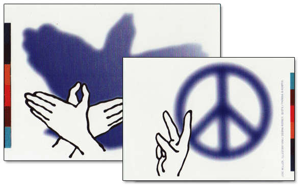
Seasons card, 2001
- Project Seasons card, 2001
Working Design has a long history of working with organizations advocating for people with disabilities. Our work with BCACL – the BC Association for Community Living – and PLAN – Planned Lifetime Advocacy Network– goes back to the early and mid-90s. While we haven’t worked with any groups working for the hard of hearing, we thought this would be the perfect season’s card for them. If you know of any organizations that would like to use this card as a fundraiser or would like us to adapt the idea to raise money, we’ll be glad to help out at no charge.
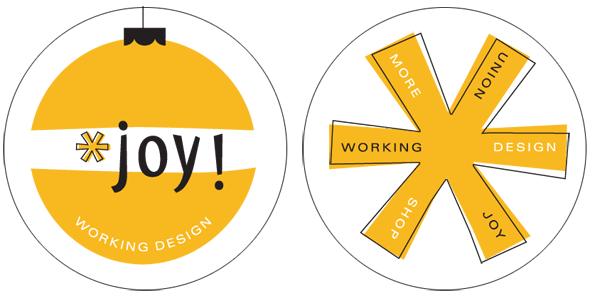
Hanging decorations, 2004
- Project Hanging decorations, 2004
We designed these two-sided, die-cut decorations to hang on your Christmas tree.
Seasons card, 2002
- Project Seasons card, 2002
Seasons card, 2003
- Project Seasons card, 2003

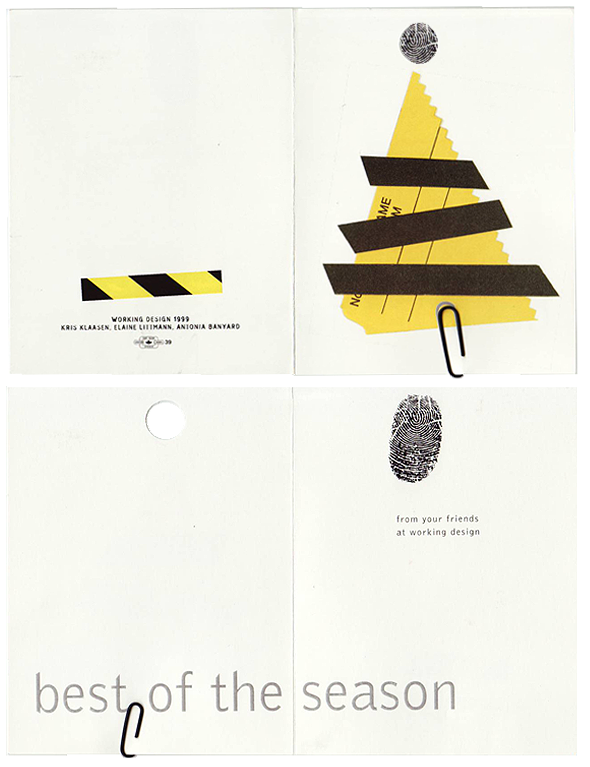
Seasons card, 1999
- Project Seasons card, 1999
Hanging decoration, 1990
- Project Hanging decoration, 1990